HUGE Update! by Shingo Shimizu

Long overdue, I’ve finally came around to updating my portfolio. The recent update includes UI design, new Eastbound Brewing Co. beer illustrations, and a tonne of icons. I’ll probably have to minimize my shown works at some point soon (it’s getting quite bloated). Until then, enjoy the images, and tell all your friends! Thank you. :)

New Prints Available! by Shingo Shimizu

These 3 original works (‘JPN:RGB’) were painted on 6 x 6” canvases with acrylic gouache. All paintings were sold at the Small Cures 2019 art show in Toronto. Was a little sad to see them go, but had them scanned before the show, and finally got around to cleaning them up a bit.

These are Giclee Prints on Strathmore Fine Art Paper. 7.75 x 7.75”. Signed and numbered edition of 100.

Check them out in the shop!

12-Poster-Mockup 3up-shingo-shimizu-2000.jpg

Small cures art show 2019 by Shingo Shimizu

I participated in the annual Small Cures art show again which took place last month in Toronto, and decided to submit three pieces! Their format of using only tiny 6 x 6” canvases, made me struggle to figure out what to paint, again. The complexity of the piece should be rather simple because of the size, I thought. Should I draw a simple object? Some fun interesting typography? Or abstract? It had to be not just something simple, but also humorous and relatable. With last year’s Small Cures show, I went with doing something simple and humorous. I painted a cute vinyl record character chilling on a staircase looking back at the viewer seductively. That’s it. Super fun. I also thought about doing a cassette and a cd of course…but just wasn’t in the mood at this time. Just wanted to paint something refreshing for a change.

One day I came across a silly youtube granny rap video called ‘Oba Funk Osaka’ describing what a ‘Osaka Obachan’ is. And then I remembered seeing them everywhere from my Osaka trips, and started sketching out my version of her. Then I realized I had forgotten that there are so many types of characters in Japanese society that are so distinctly Japanese and visually interesting. ‘That’s it!’ I thought. Soon after I sketched out the ‘salaryman’ and then the ‘construction worker’.

Halftime Onigiri: This salaryman I wanted to be the overworking underpaid 50 something year old fellow taking a 5 minute lunch break during the day with his modest lunch-in-hand: an onigiri. He then would be sitting back on one of those kiddie jungle gym springy thingies (what do they call those?), possibly fantasizing about being young again. Or he’s fantasizing about new love? Hmmm? Either way the flat background emphasizes that he’s in a place outside of reality.

Ichigo Milk: The young construction worker wears a ‘safety first’ helmet, typical of a Japanese construction worker. The uniform is called a ‘nikka pokka’ and the boots are ‘tabi boots’ (I made them rollerskates!). He also has his bling rings, aviator glasses, and most important of all: his strawberry milk (ichigo milk). All this retro, gets him in his zone.

Osaka Obachan: She’s the polar opposite to the Salaryman. She’s enjoying every bit of her life, and showing age ain’t nothing but a numbaa. She wears her love of leopard print, Adidas, Asics, red lipstick and shades. Ok I added the mixed sport brands. Oh and the pogo stick. Hey gotta have fun with it right? I like the juxtaposition of the old with young items, and young with the old items. So yep i guess looking at the three: it’s all about age perspective. Also maybe about people dealing with stress lol.

Anyhow, had so much fun on the night of the event. Huge turnout that night, with a lot more artists this year exhibiting. They were even serving Beau’s beer this year! Thank you again to the organizers for having me, the people that bought the works, and all the people that came out!

Lastly, I really wanted to stay with these, so I ordered some prints for home! If you’re interested hit the button below. :)

New Print & New Shop by Shingo Shimizu

01-Giclee-ShingoShimizu-Niseko-1500.jpg

This ‘NISEKO DEEP (BluRay version)’ is one of my favourite pieces so far. I sort of got lost in thought working on it, as someday I would LOVE to go. Also it was pretty much like restoring a lo-fi piece and making it high def, just like a restoration artist. It’s quite fun.

I call it the BluRay version, simply because it was originally made for a width of 4”, and then I had requests for a much larger print version of it. In simple terms: ‘resolution’ doesn’t scale up nicely. This is roughly 4 x larger than the original size, so lots of details like: textures, details (snow, kimono, skis, adjustments, etc) had to be added in. The original illustration was featured in The Economist 1843 magazine (Feb / Mar 2018). Also this is a premium giclee print (or ‘fine art print’) on Strathmore Fine Art Paper, so the colours really pop with a really sharp image. Measurements are 18 x 24”. Signed and numbered edition of 100.

macbook-shingo_shimizu_shop1.jpg

The Shop section got a slight facelift. Images now have ‘in situ’ images, as well as the artwork on its own. Looks more like a proper gallery now. Check it out.

SMALL CURES ART SHOW 2018 by Shingo Shimizu

Only managed to squeeze in this little 6 x 6” canvas painting completed for Small Cures Art Show & Auction 2018.

In the beginning I painted a version with wavy lines in the background. For some reason I had some acrylic medium kicking around and thought I’d give it a go. Long story short: paint got all goopy because I was suppose to dilute the medium with water before mixing. Gotta make mistakes…at 3am.

Luckily they gave me a spare just in case I was a little ambitious. On the second go round I simplified and punched up the peachy pink. Also originally I wanted to do a cassette gal and cd guy of course, but…it’s been done so many times (YES, so is vinyl). I still LOVE vinyl, but yes it’s another overdone visual…I was only in the mood for this last one sexy record, and that’s it. Hopefully next year I’ll get back to drawing more people. As it was a one off, but spent a few late nights with it. I grew fond of this little fellow. Just look at that face! Anyhow it was for charity. It sold for $350 at the end of the night! Mission accomplished. zzz.

Exclaim! magazine by Shingo Shimizu

Started as Art Director for Exclaim! magazine in spring of this year. Here are a few covers and feature stories I designed.

From issue to issue, I am usually learning about or listening to a new band or artist that is new to me. The process always involves me either YouTubing their videos, or Wikipediaing their bios. I wonder what music magazine Art Directors did back in the day before the internet on bands they didn't know? I imagine many poor librarians having to archive newspaper and magazine clippings...oh internet I love you. 

Anyhow, we also commission illustrators for portraits for our 'Reviews' page. I've also been enjoying those quite a bit. I will post some of those soon as well.

For now, check them out here!

the Economist 1843 magazine by Shingo Shimizu

Hello Thursday.

As I said, just getting around to updating my portfolio. I completed these illustrations for The Economist 1843's 'Japan Travel Supplement' earlier this year. Included below are a bunch of sketches that missed the mark, but I had fun with them, so I included those here as well.

Also got to draw a woman skier in a kimono for a spot illustration on the inside. Check it out below.

The final artworks can be seen here. Check it out! :)

CBC MUSIC 94.1 FM by Shingo Shimizu

Happy Friday! :)

I'll be updating every few days in the next little bit. I'm really behind in updating my website these days... (FIFA, Summer weather...) let's move on.

Here's my illustration for CBC’s morning radio show: ‘Mornings with Raina Douris’ on 94.1 FM in Toronto. The show airs Monday to Friday from 6 to 9am. 

Direction-wise: I decided to go mostly with morning imagery set to a uplifting beat, and a highly caffeinated triple shot of sunshine-y 80s. The only Toronto reference is the CN Tower...Sam the Record Man was taken...I suppose there are others...? No I don't think so. The donut headphones is definitely my favourite part!

Used as posters, billboards, and on TTC streetcars across the Toronto. Check it here!

Site Update: Stonemill Bakehouse by Shingo Shimizu

Hope you're having a great Friday. Just wanted to share a new update today!

I illustrated a very Canadiana pattern for a Stonemill Bakehouse bread wrapper. It was to commemorate 'Canada 150' this year, and this limited 'Canadian Heritage Grains - Coast to Coast Multigrain' bread was seen on shelves nationwide!

Check it out!

Shingo's Boxing Week Sale! by Shingo Shimizu

Available now at the Inprnt Store.

DECEMBER 26-31, 2016 (until midnight)
'SHINGO'S BOXING WEEK SALE'
25% OFF ALL PRINTS!

Enter code: 'F9PHWVI'.

ALSO, you may have noticed that the SHOP tab, now has a drop down for two options: 1) Limited Prints, 2) Inprnt Shop.

After some consideration, I've decided to split up the shop into two options. Option 1, for limited prints and miscellaneous items (like stickers), and Option 2 for other classic prints for purchase (like the one above.) to be all handled by my Inprnt Shop. No worries, the promo code will work in both stores!

In the new year I'm hoping to produce more new art pieces for purchase (iphone/ipad cases, etc). So please keep coming back. Of course if you have any questions, please do let me know! 

Start to Finish. New Series of 12. by Shingo Shimizu

Hello, been a while!

I've been away with a full time position as a graphic designer. But now I'm back as an illustrator! There were a few projects I was able to work on, and will hopefully get around to it updating my site over the next month or so. Also to get the illustrator gears running again, I've cranked out this small series I call 'Start to Finish'.

These images were originally conceived as parts of a collage illustration for an article. I always found them so humorous, but thought it was a shame that they were so tiny and under developed. They had potential to be individual pieces, if they were given some love. So after leaving my full time job, I decided that this would be the first series I would work on as a personal project.

Also I've always thought that 'context' was such an interesting thing. I mean some images here are more obvious than others. But placing an image in a certain context, our minds connect the dots to give it new meaning. For example placing like placing a 'hello kitty' on some underwear, or some well known branding on a stack of condoms. It's no longer 'just sex'. It's become something more than that. 

Here they are as a series of 12, with more love (12 x 12").

Prints available for sale upon request.

Also follow me at the links below :)

Applied Arts Twice. 3x3 Twice. by Shingo Shimizu

It's been quite a while since my last post. Not that I've been one to post daily, as if it were my personal diary. Was away on quite the experience in Japan (which will be covered in the next issue 7 of Scion magazine).

Anyhow I am happy to announce that my work on the 'Northern Exposure' article in issue 5 of 'Scion magazine' was selected a few times for Illustration annuals and the 'Troy Sumitomo' (from Five Axis) portrait as well! 

'NORTHERN EXPOSURE'
ADVERTISING & PORTRAIT ILLUSTRATION
Applied Arts 2014 

'NORTHERN EXPOSURE' & 'TROY SUMITOMO'
PORTRAIT ILLUSTRATION
3x3 Illustration Annual no. 11

Saatchi & Saatchi Canada 
Executive Creative Direction: Brian Sheppard, Helen Pak 
Illustration: Shingo Shimizu 
Editor in Chief/Magazine CD: Lisamarie Chen 
Client: Toyota Canada

troy-sumitomo-shingo-shimizu.jpg

Scion Magazine - Issue 6 (Inside Issue) by Shingo Shimizu

Scion Magazine Issue 6 (Inside Issue) continues in the same format as issue #5: 48 page magazine at 10.25" x 14.5", printed on the matte recycled stock. I want to send a big shout out to the Scion team: Lisa Marie Chen (Editor-in-Chief), Olivia Truong (Designer / Illustrator), Rachel Kennedy (Designer), Shauna Roe (Writer), Sheraz Amin, and newcomers to the team: Joel Arbez (Art Director), Christian Buer (Designer / Illustrator), and Matt Antonello (Writer). Thank you for all your hard work!

With the cover, we decided to go with an illustrated execution. I won't get into the technicalities of this particular FR-S on the cover (it's been strongly influenced by my recent trip to SEMA and the Tokyo Auto Salon.). Anyhow, the theme being 'Inside', I'll admit it was quite difficult in honing into an idea that would convey this. The magazine was to be released at the Toronto Auto Show, so it was mandatory that a car be on the cover. Without overthinking the concepts of 'inside' and a car, we decided to keep the idea rather simple, and then push much harder on the execution. 

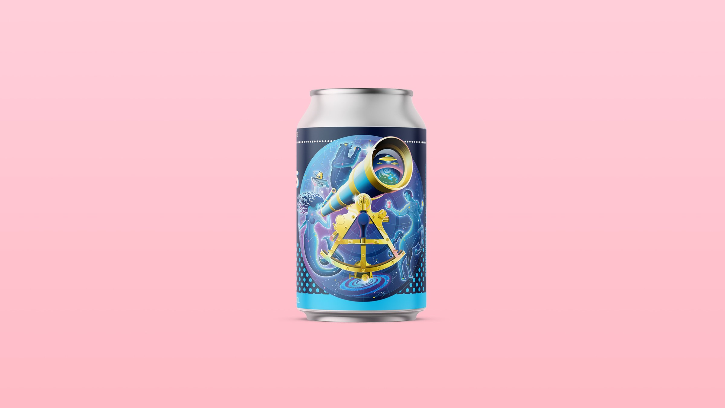
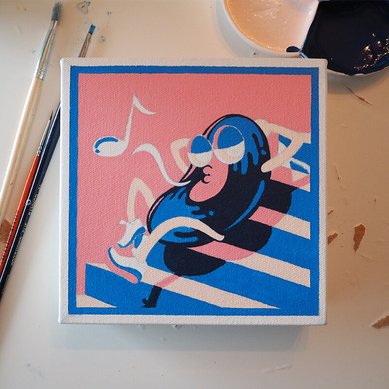
Each of the elements exploding out of the open hood refers to each one of the stories or ads in this issue. The back cover (again very simple), is the back of the FR-S, (inside of a tunnel) driving towards the opening (url). The illustrations are treated more 'graphic-like', coloured in only black, white, and 2 PMS (green & blue). The goal was to look 'wintery' without the typical wintery imagery or colour palette.

Inside the magazine, you'll notice that there are 5 car ads (with animal heads). These pages are all LAYAR activated, meaning they all play some fun video content. A big shout out to the team that worked on this: Joel Arbez, Christian Buer, Lisa Marie Chen, Clay Stang (Photographer), Reynard Li & Rico Moran (Assistants), Matt Antonello, Kyle McNair (Video Editor) and Pat Cyr. Some of us got to be photographed with a mask on. Can you guess who's who?

Last but not least, there is also a fun video of designer, Matt Law (ML24) drawing a car from start to finish in his story, in which he is interviewed by none other than Troy 'Five Axis' Sumitomo! Let me know what you think of the latest. 

CHECK IT OUT HERE!

scion-magazine-6-cover-1.jpg

Welcome to the new site! by Shingo Shimizu

Good morning! I am excited to announce the new site for shingo.ca! The content is more or less similar from the older site. Actually probably less works, as it was getting a bit crowded on the last one, and an overhaul was way overdue.

You will find the new site is scalable, so it can be viewed nicely on your mobile devices, when your showing it off to your friends or possible clients! Notice it's a lot crisper too?

As for my character designs, there not up yet (except the quiznos stuff) but I'll put up some eventually (ScotiaFinancial stickman).

I still have to work on some updates with some new work in the upcoming weeks, so either subscribe to the newsletter or subscribe to the RSS feed (both on the right). Definitely follow me in the socialverse below!

Help me commemorate this occasion with a 'like', 'tweet', or a 'share'! If you have any comments or suggestions please let me know (more eyes on it the better right?).

Have a wonderful day wherever you are.

Scion Magazine - Issue 5 (the Storytelling Issue) by Shingo Shimizu

Scion Magazine Issue 5 (the Storytelling issue) continues in the same format as issue #4: 48 page magazine at 10.25" x 14.5", printed on the matte recycled stock.

This is definitely my favourite of the covers for the magazine. Not only is it very different from what we've produced thus far, it's our first photographed cover (issue 3 only the cars were photographed, so that doesn't count). It also probably looks the simplest, but it wasn't! There was so much prep work beforehand in painstakingly designing and building the covers (which would not have been possible without our fab interns Olivia Truong and Ilona Fiddy), and then beautifully photographed by Andrew B. Myers. Also thanks to Lisa Marie Chen, my partner in crime on every issue, the Editor-in-Chief.

The textures and patterns are a combination of papers from 'the Paper Place' on Queen West in Toronto (I could totally just spend the day here...), as well as our own designs. The book spine designs reflect each of the stories in the magazine, as it works as a Table of Contents page as well. The challenge I face is always the bilingual factor, (as it is a Canadian magazine) with an English and French version. The type was added in post. To bring in 'car content' we put the 'Scion Book' on the front cover, reveals that it's Scion coffee table book on the back cover, with a Scion tC on its cover. 

CHECK IT OUT HERE!

Scion Magazine - Issue 4 (the Music Issue) by Shingo Shimizu

Apologies, for not posting for a while everyone! It's been quite busy since this project ended (which is SO great), but it means I have no time to write a proper post. 

Scion Magazine Issue 4 starts off a new format: 48 page magazine at 10.25" x 14.5" but still printed on the matte recycled stock. It's also the first of 'themed' issues, starting with 'the Music Issue'. Yes it was very exciting: bigger, more pages, and lots of music content! I thought I'd actually get quite tired of drawing speakers, records, or headphones...but surprisingly I didn't! It makes for great practice too~. 

Anyhow, more stuff being posted this week! Seriously. :)

CHECK IT OUT HERE!