TRACING WITH VECTOR
Once the concept sketch was approved, I went ahead in Illustrator, to trace out the line work, laying in a basic colour theme.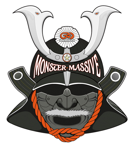
TYPE INSPIRATION
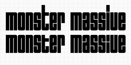
I forget the name of the placement font I chose here. The font of course, had to convey a samurai energy to it. I wasn't too happy with the font choice (please ignore the typesetting…) Conveniently, stuck with my problem, I hadHelveticaplaying on the TV, where it showed Wim Crouwel's 'Hiroshima' work.

TYPE #1
Right then, I thought 'perfect', and brought the grid up, and created my own version for 'Monster Massive'.
TYPE #2 AND MORE DETAIL
Then I warped the text onto the helmet, and further adding details. The left and right wings of the helmet include a crest like symbol in a circle. Obviously, I have made up one in this case (why not?). It's only a 'katakana' first letter of 'Mo' (as in Monster) and 'Ma' (as in Massive) to make it look like a crest of a clan.
PRESENTATION #1A
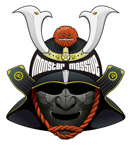
At this point, the client decides to go with 6 colours: CMYK with Gold Metallic and Invisible UV inks. (before it was sort of up in the air.)
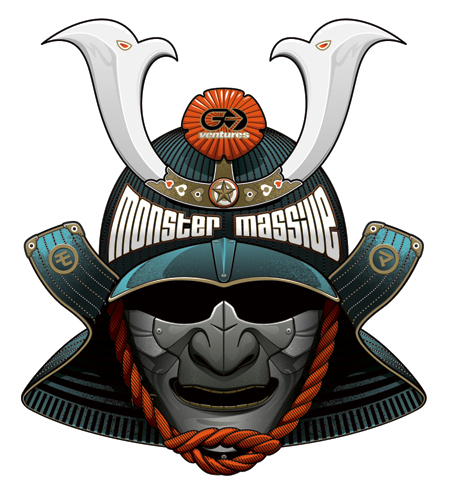 I then jazzed up the art with more patterns and textures. I then go for a slightly progressive colour with an electric blue, that feels more clubbier. By the way, I've dropped the moustache, for gold teeth. I never knew why samurai masks had moustaches on them. Perhaps it was to show who's more man than the other?
PRESENTATION #1B
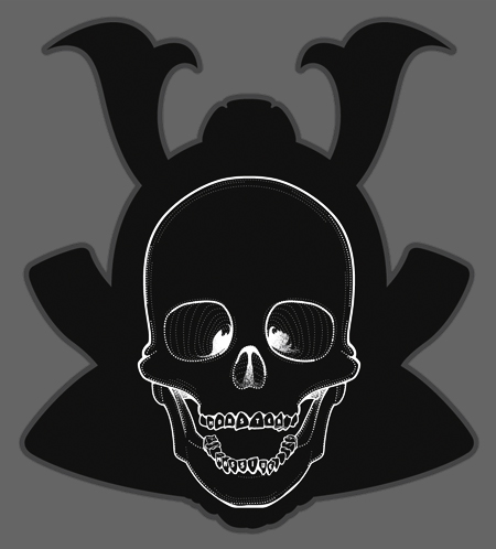
Anyhow, after I did all that, the skull artwork (the hidden image) was much more easier. I decided to treat most of the line work with dots, to give it a fun bling-like feel. I've also included 'Monster Massive' in the teeth. (All in the deets…)
I then showed the client for the first time, since the roughs.